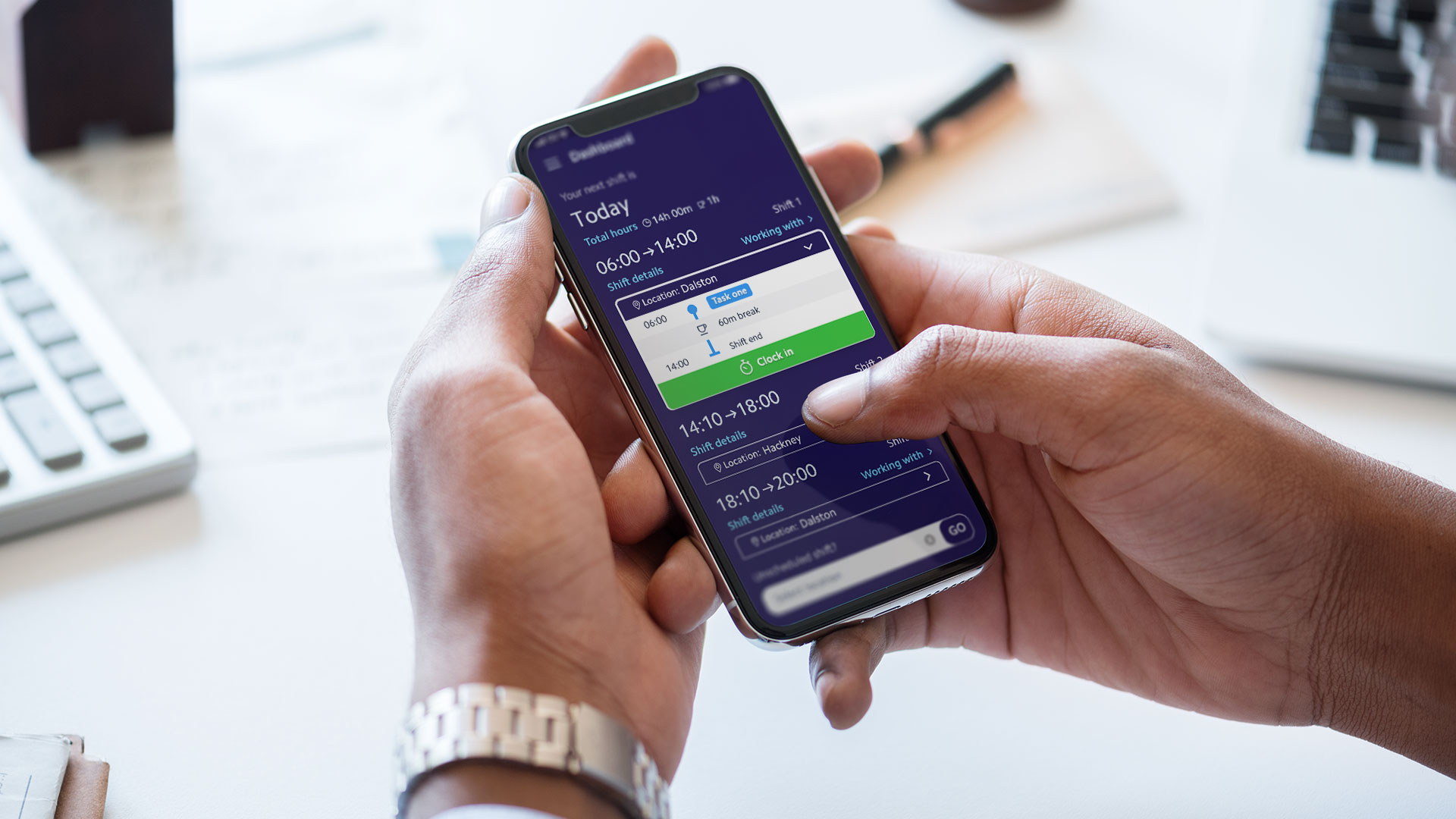
As a senior UX/UI designer on a workforce management SAAS platform, our project aimed to revolutionize the user experience for employees and shift managers. The existing system allowed employees to clock in and out of their shifts through the app, but they were restricted to a single location.
Our challenge was to design a new system that would enable shift managers to allocate shifts at multiple locations on the same day and provide a user-friendly interface for employees to easily view, understand, and manage their shifts, even when they had multiple shifts in different locations.
My role in the team:
My responsibilities:
The scope of work
Interviews
Personas
User Journey Map
Thematic Groups
Interview with Users
As primary qualitative research, I have conducted 12 remote interviews with customers.
I defined 2 groups of users with 6 shift managers and 6 employees.
This helped to find the most important user challenges and pain points from both sides.
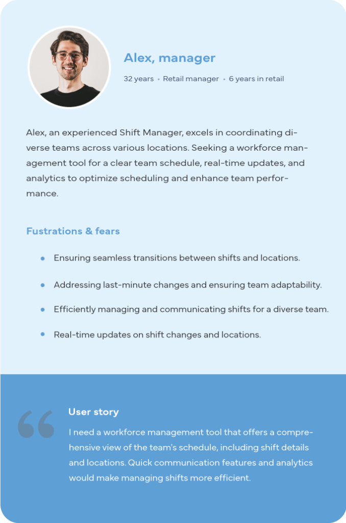
During the interviews, I learned that shift managers had to manually inform the employees and the rest of the shift managers on every occasion that multiple locations were required which was an extended time-consuming process and caused a large area for human errors to occur that had devastating impact to the business schedule.
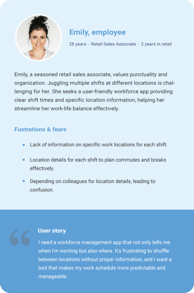
Employees from their side were feeling anxious as the information regarding the location of their shift could change with an email, which was not always seen at the right time or they had to be informed orally of any last-minute changes. Bringing the overall trust of the company organization to very low levels.
User personas
The insights I got from the interviews led me up to create the personas.
Here are some highlights of them
User journey map
For each type of user, I create UJM to understand pain points and challenges that can be improved.
Here’s a preview of UJM for the employees.
Thematic groups
As part of my effort to understand the pain points and issues faced by users, I gathered information from various sources including customer support agents, online chats, social media platforms, surveys, and our own employees.
This helped me develop a comprehensive understanding of the challenges users face while using our product and create a centralized knowledge hub.
This multifaceted information-gathering process has significantly contributed to the development of a comprehensive understanding of the intricacies surrounding user experiences with our product.
Multi-Location Shifts
Redesigning the system to support employees having shifts in multiple locations on the same day, making it intuitive for both employees and managers.
Limited Screen Space
Addressing the challenge of fitting all shift information into the limited screen space of a mobile phone, particularly for employees with numerous scheduled shifts.
Shift Order and Skipping
Designing a system that could present shifts by timeframes and allow employees to skip a shift if necessary, without disrupting the order of their shifts.
Geolocation Verification
We incorporated geolocation technology to authenticate employee presence at designated work locations during clock-in and out events.
Managing Forgotten Clock-Out
Addressing the possibility of employees forgetting to clock out when leaving a location and providing a solution to manage these situations.
Unscheduled Shifts
Allowing employees without scheduled shifts on a given day to clock into unscheduled shifts, giving shift managers flexibility to fill gaps as needed.
Generate ideas
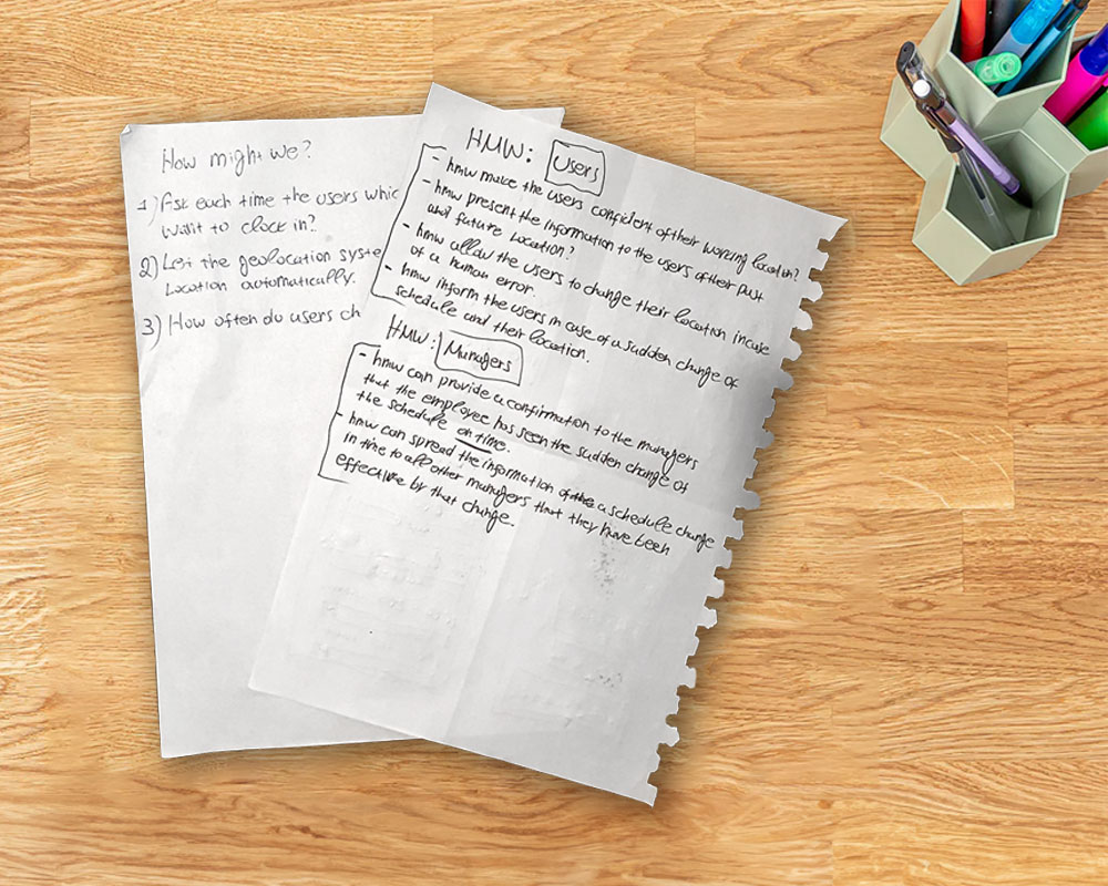
How might we
During our ideation process, we aimed to explore various solutions to tackle the problems faced by our users. To achieve this, we leveraged the HMW technique, which allowed us to develop insight-based, actionable questions.
These questions served as a foundation for generating a multitude of ideas that were focused on addressing real-life issues experienced by our users.
Crazy Eights
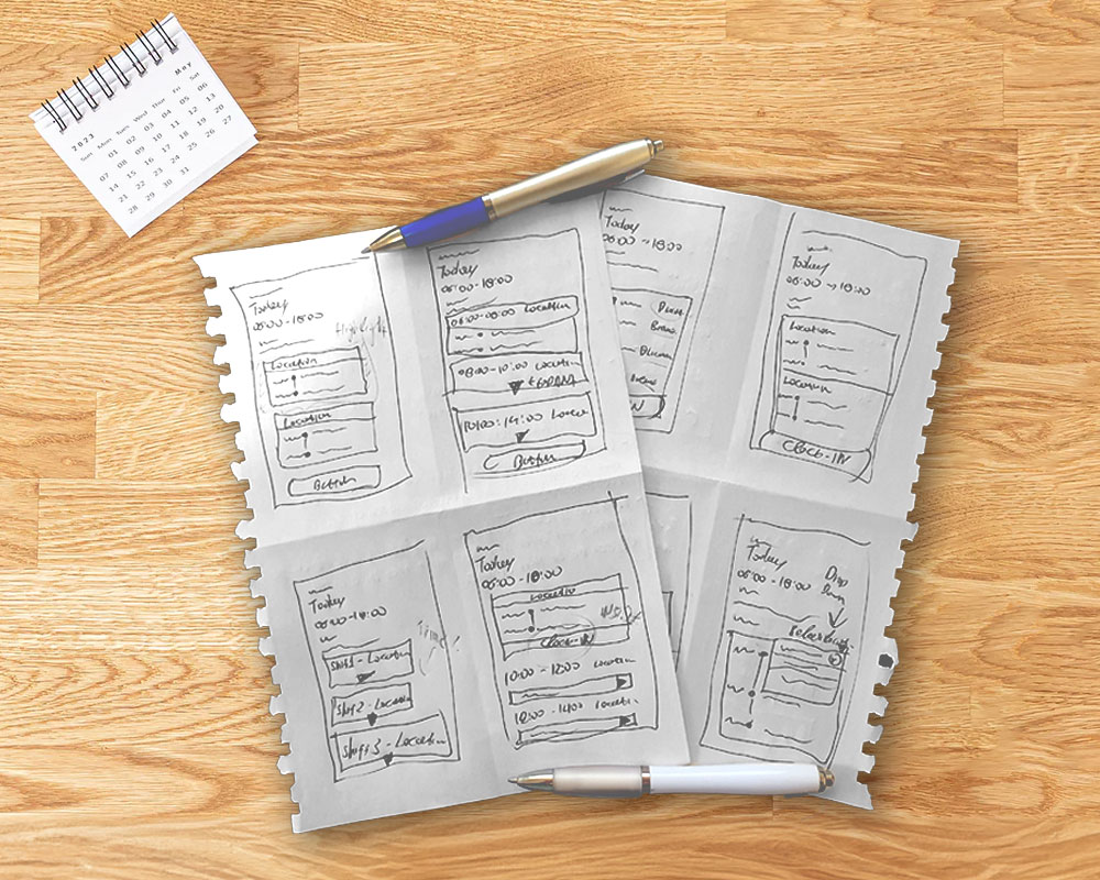
During the Crazy Eights exercise, we aimed to generate the maximum number of ideas within a short time frame, with an emphasis on quantity rather than quality. As a result, each participant had 8 sketches of different pages.
After the exercise, we reviewed each idea and identified the key elements that could be used in future wireframes. We also wrote down additional questions that needed to be addressed.
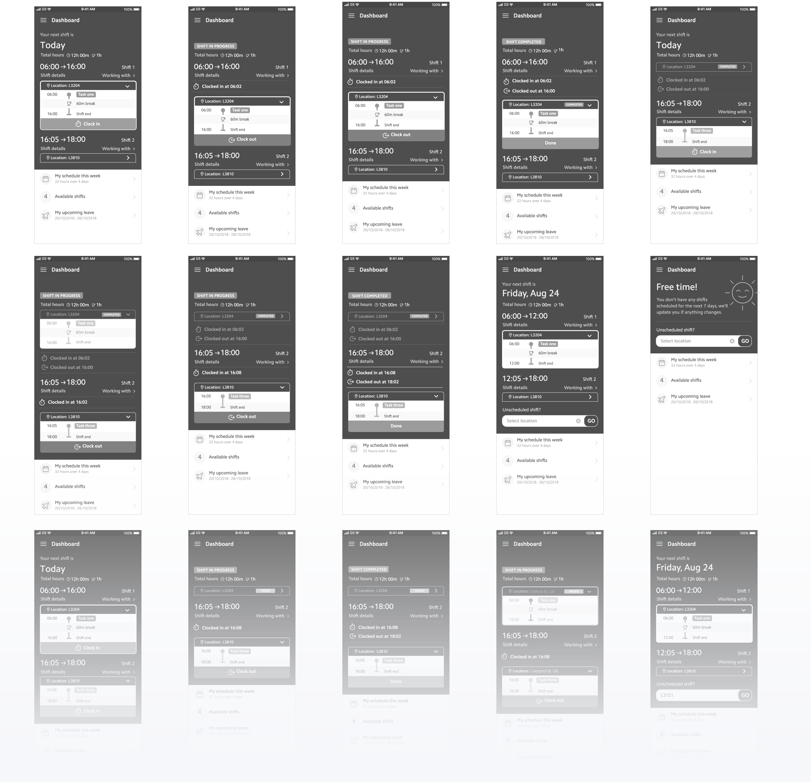
Wireframes
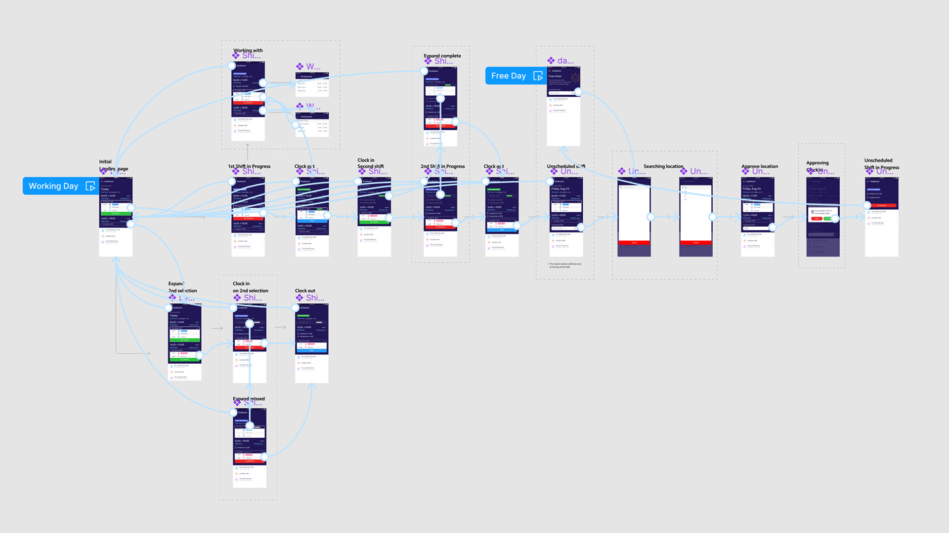
Prototype
Multi-Location Shifts
We created a new design system that allowed employees to have shifts in multiple locations on the same day. Shift managers could easily allocate these shifts through the platform.
Limited screen space
To address the limited mobile screen space, we implemented a solution to collapse all shifts except the current running shift or the next available one. This minimized screen space usage while ensuring essential shift information was readily accessible.
Our research identified that up to 90% of our client cases that will need the multi-location selection will restrain between 1 and 3 shifts per day.
Shift order and skipping
The system presented shifts based on their timeframes, but employees had the flexibility to skip a shift if needed without disrupting the order. This provided a user-friendly approach to managing shifts.
Geolocation verification
Geolocation verification was integrated into the system to ensure employees were at the correct location when clocking in or out. This feature added an extra layer of security and accuracy.

Managing forgotten Clock-out
To address the issue of forgotten clock-outs, the system identified the time and location of the new clock-in request. If it met specific criteria, the system automatically clocked the employee out from the previous location and in at the new one.
Unscheduled shifts
Employees without scheduled shifts could clock into unscheduled shifts. This flexibility allowed shift managers to fill gaps in various locations with willing employees.
