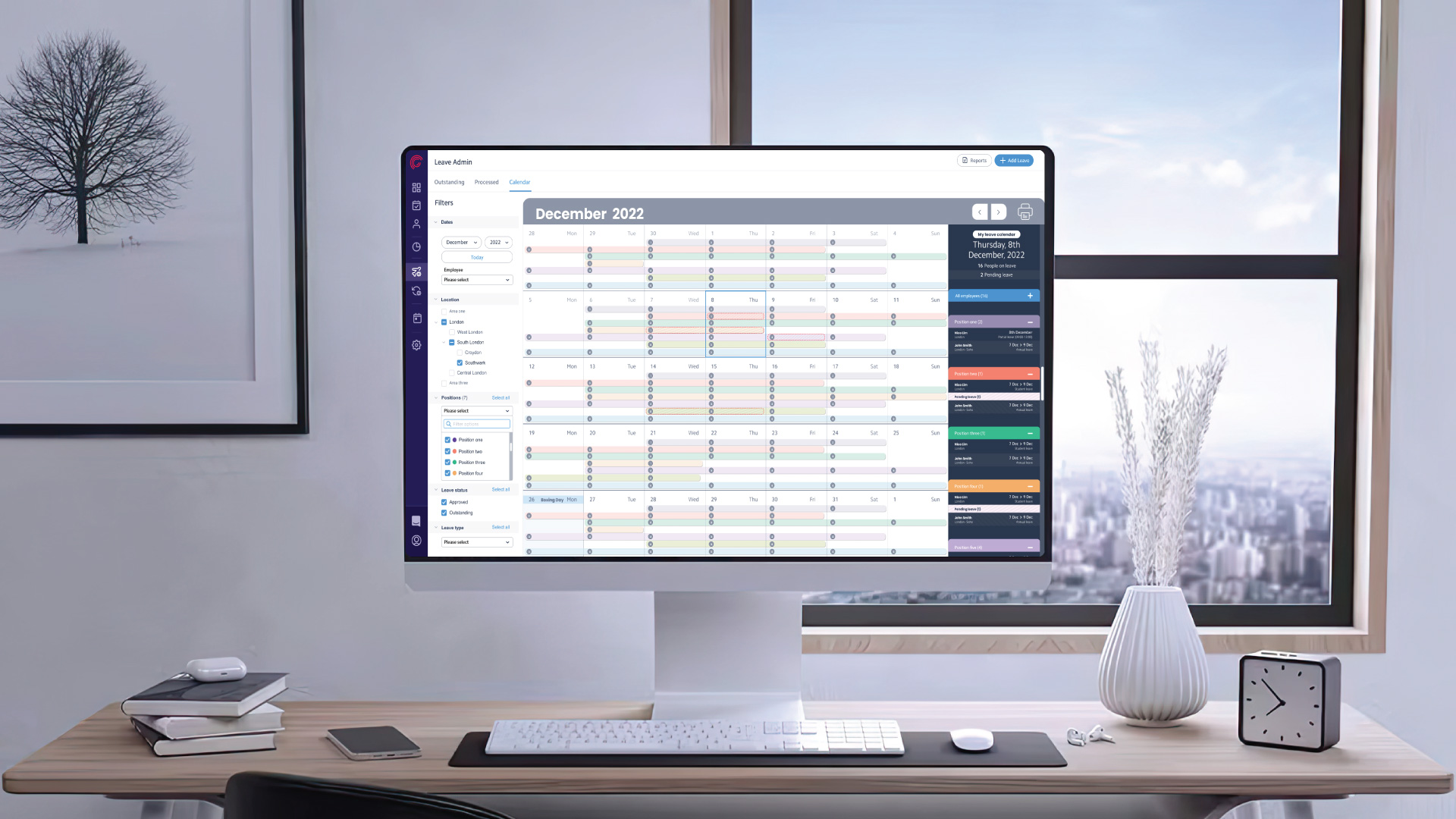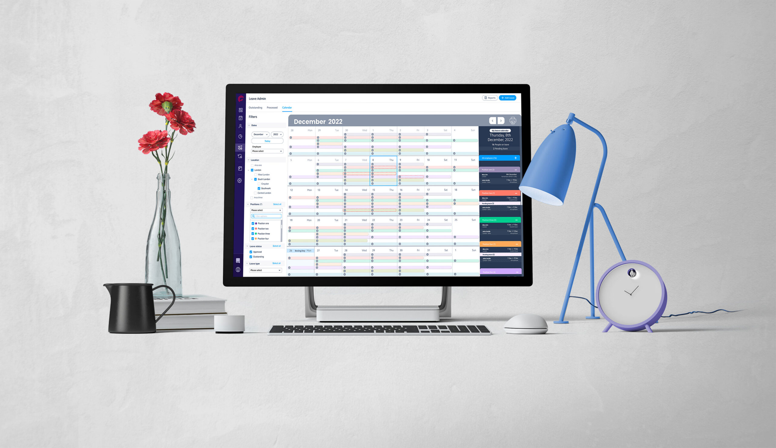
While I was working in Rotageek, a workforce management SaaS platform as a senior UX/UI designer I was given the opportunity to take charge of a critical project to enhance the platform's functionality. The goal was to introduce a dedicated calendar section for managers and super admins, enabling them to efficiently track and manage employee leave schedules.
This addition aimed to empower decision-makers with clear insights into leave balances, location-wise or position-wise, facilitating quicker and more informed leave request approvals.
My role in the team:
My responsibilities:
Key Design Values
The scope of work
Interviews
Personas
Internal research
Interview with Users
I have conducted 6 remote interviews with customers with different working structures for primary qualitative research. This helped to identify the most important and frequently used case that the absence of the “leave calendar” affected their business and identify the challenges that have caused to our customers
Users’ pain points
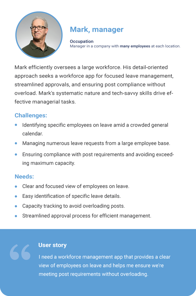
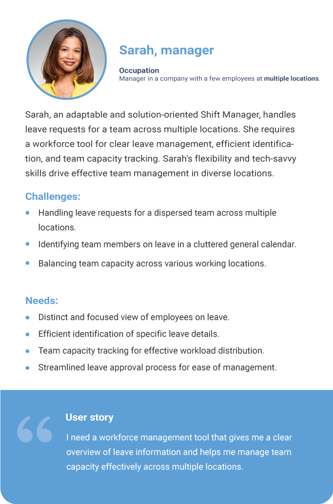
During interviews, I have discovered that managers, regardless of the number of employees they oversee or their working structures, the time they have to approve a leave, they need to view the general calendar, try to avoid the noise from all other active employers and count the number of employees on leave to ensure they have not exceeded the maximum capacity for their post requirements.
User personas
The insights I got from the interviews led me up to create the personas.
Here are some highlights of them
Thematic groups
In my endeavour to grasp user challenges, I collected insights from diverse channels such as customer support agents, online chats, social media platforms, surveys, and our internal team.
This collective information has enabled the creation of a centralized knowledge hub, fostering a thorough comprehension of the complexities associated with user experiences with our product.
Generate ideas

How might we
In our ideation, we addressed user problems using the HMW (How Might We) technique, formulating actionable questions. These questions formed the basis for generating ideas focused on real-life user issues. Encouraging a collaborative environment, team members contributed diverse perspectives, resulting in a robust ideation session.
This iterative approach sparked innovation, aligning proposed solutions closely with user pain points. The synergy between the HMW technique and collaborative ideation has been vital in crafting effective, user-centric solutions.
User Flow
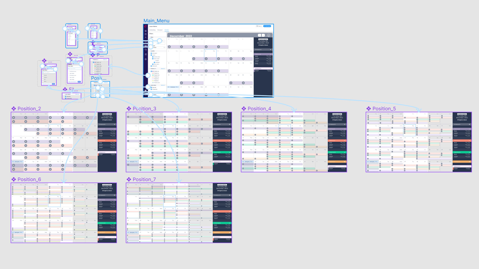
The following map represents the algorithm for the process of the Leave Calendar. By following the user flow below, managers will be able to access all the information related to leave based on their search criteria.
Our solution involved creating a dynamic and adaptable layout that could flexibly cater to the unique requirements of each client. Key components of our solution included:
Dynamic Layout
We designed a dynamic layout that could adjust according to the specific client’s organizational structure. This flexibility ensured that clients with varying configurations could efficiently utilize the platform.
Search Menu
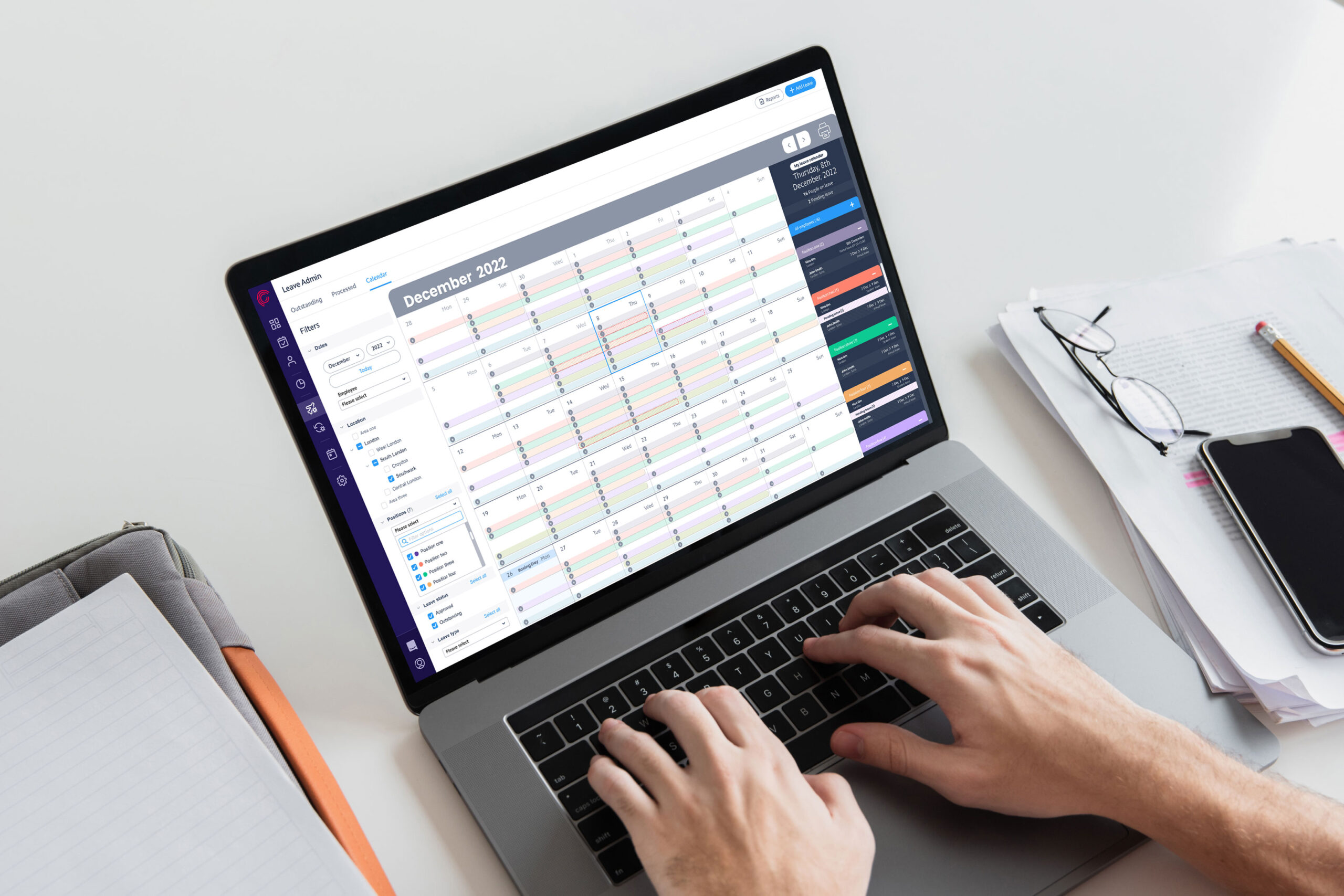
We incorporated a versatile search menu on the left side of the calendar interface. This menu allowed users to filter and display leave data based on different criteria, such as location, position, or specific employees.
Color-Coding
To enhance usability and readability, we implemented colour coding to differentiate between different positions or roles. This visual cue made it easier for managers to identify and manage leave schedules.
In-Depth Detail Reports
On the right side of the calendar, we provided an in-depth detailed report for each day. This report offered a comprehensive view of leave requests, including specifics on who, where, and why leave was requested.
Pending Leave Display
We also added a feature to display all pending leave requests directly on the calendar. This feature enabled managers to quickly assess pending leave requests and make prompt decisions.
Custom Warnings
Allowing employees without scheduled shifts on a given day to clock into unscheduled shifts, giving shift managers flexibility to fill gaps as needed.
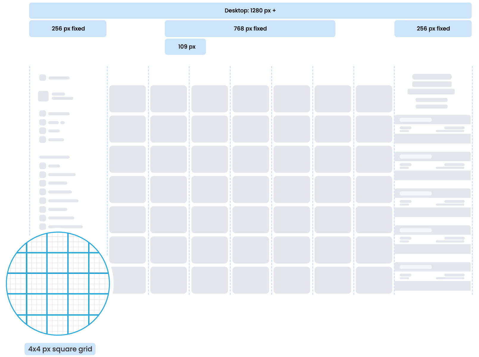
Grid system
Wireframe
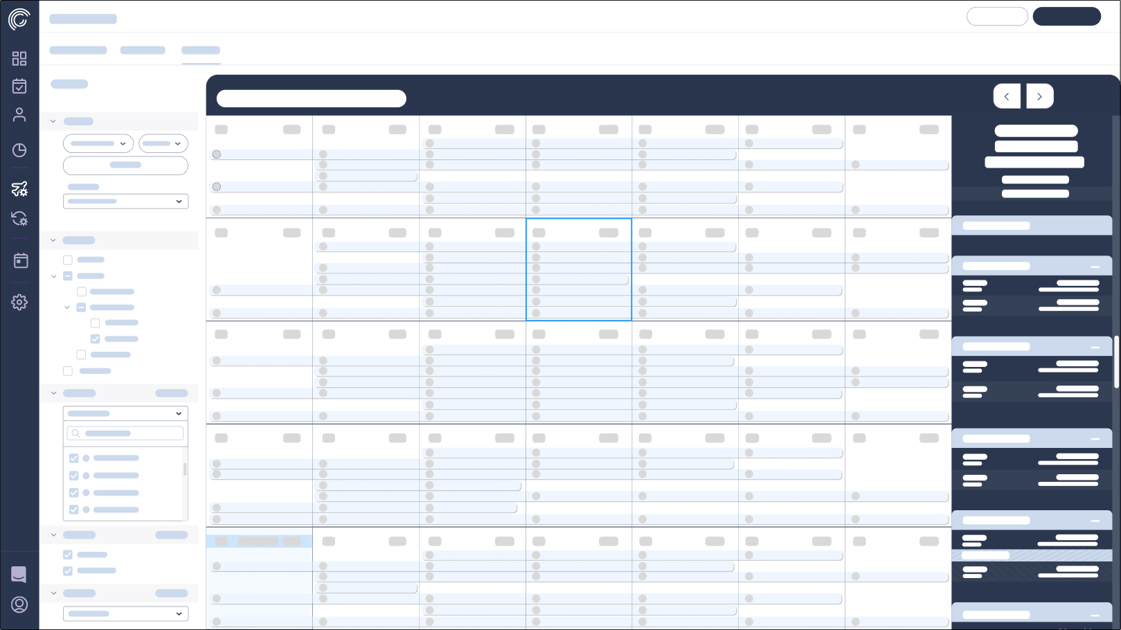
Prototype
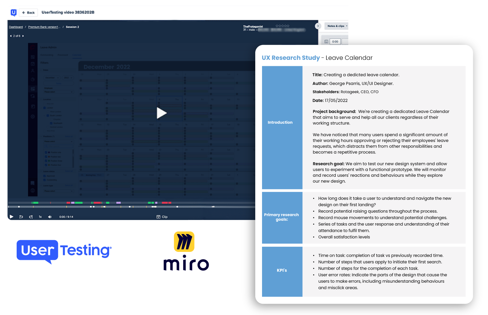
Research goals
We aim to test our new design system and allow users to experiment with a functional prototype. We will monitor and record users’ reactions and behaviours while they explore our new design.
Methodology
Unmoderated usability study
KPIs
- Completion rates
- Time on task
- User error rates
- System Usability Scale
Participants
Managers with experience from our previous system.
Experience: from 2 months up to 4 years.
Operating system: Windows 11
Age: from 20 till 54
Gender: any
Different abilities include:
- 1 user with visual impairment
- 4 users who aren’t fluent in English
Solving UX-problems
After conducting the usability study, I incorporated user feedback and made improvements to the designs. Here are some examples of the changes made.
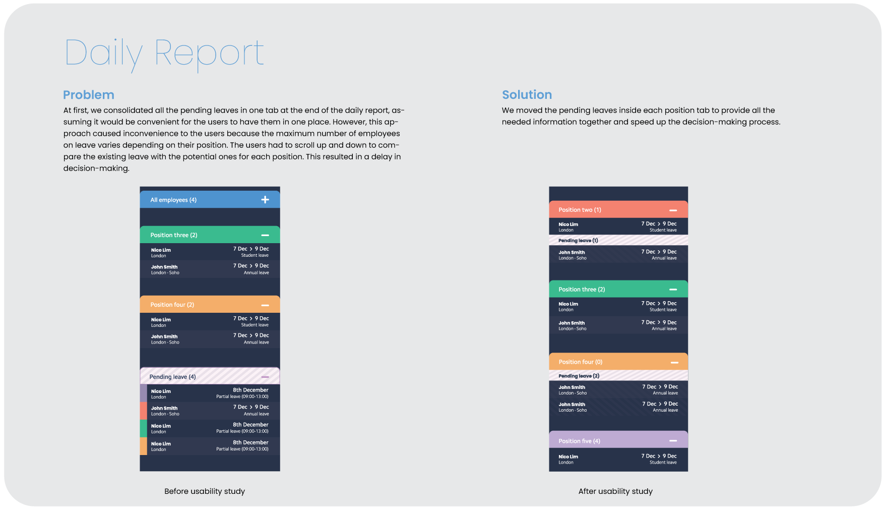
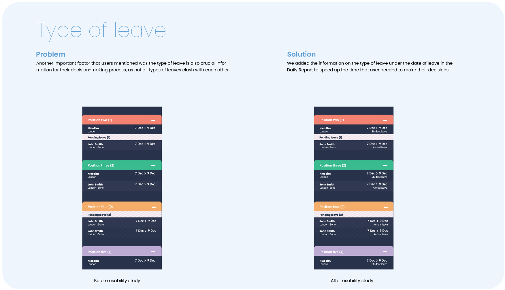
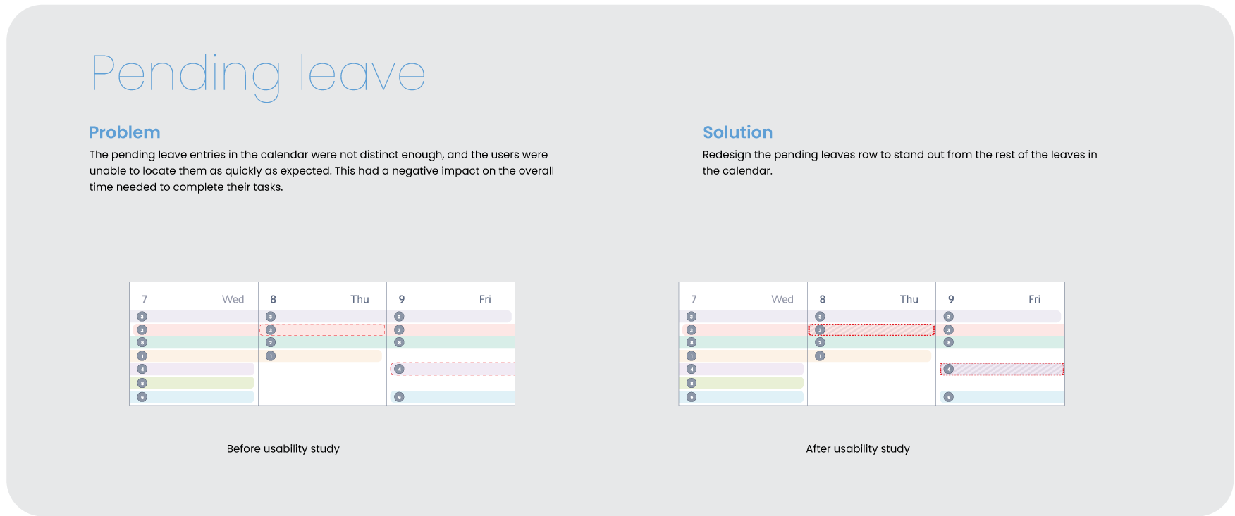
Calendar Boxes – Separate stages
When the leave calendar page loads initially, will always have pre-selected the current day (blue border) with the right tab showing the details of that day. Selected day (black border) with the right tab showing the details of that day.
Calendar row system
Behaviour
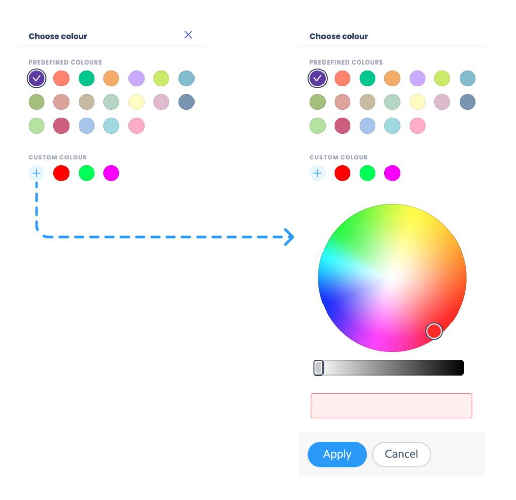
When a new position is created, the colour will be added automatically. There is a 25-colour collection that will constantly be rotating. Based on account jurisdictions, the users will be able to change the position’s colour. They can select one of the pre-selected colours or create their own.
25 premade colours
Behaviour
Only positions that include leave will show.
The “All position” tab will always be available at the top of the column.
Initially, the “All position” tab will be at the stage of collapse and the rest of the position tabs will be expanded.
The order of the position tabs will follow the order of the position in the Filters column.
When the content is longer than the visual space of the column, a scroll bar will appear to allow the users to scroll. Ideally, the scroll bar should respond to the mouse wheel too.
