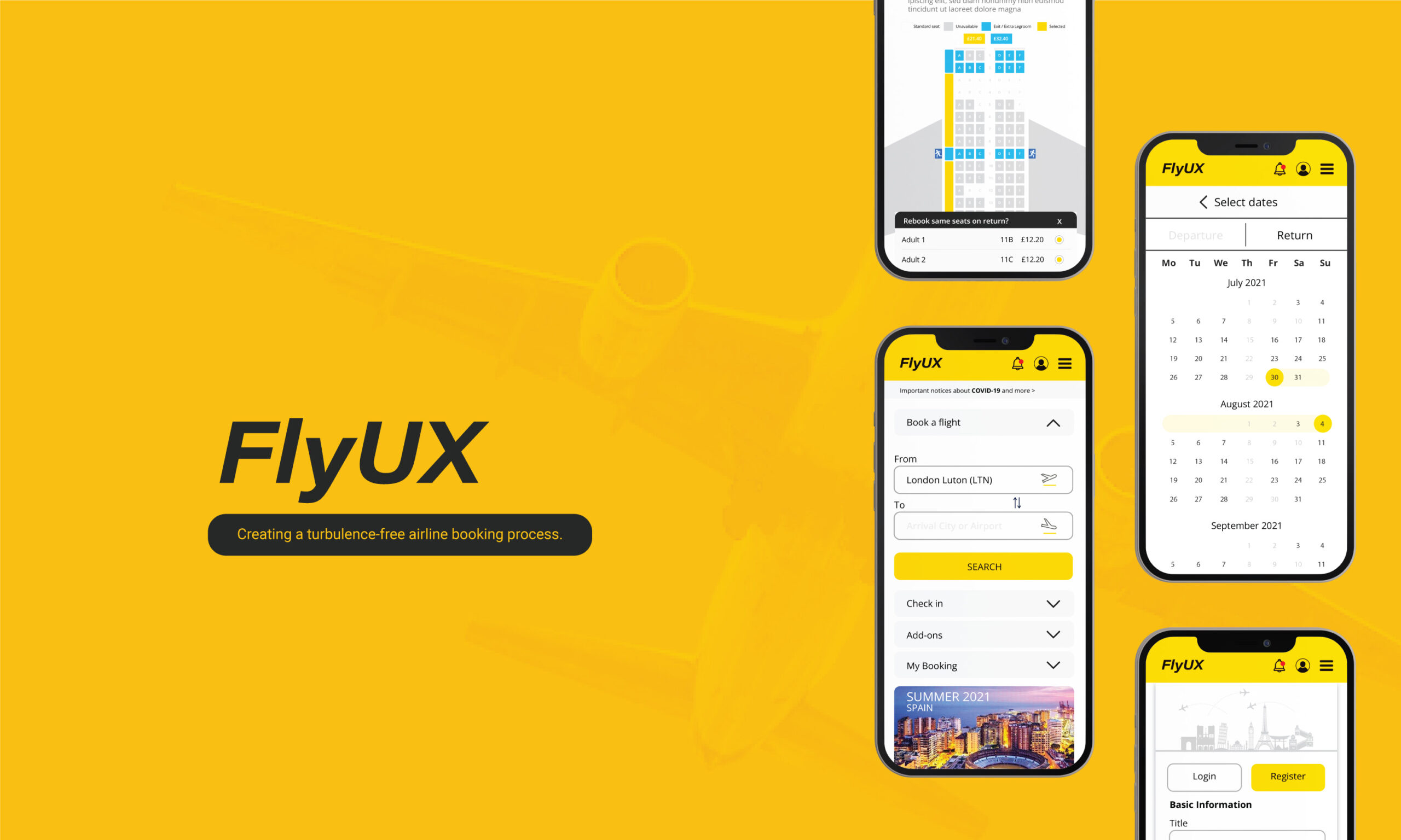
As part of my Diploma in UX Design from the UX Design Institute, I was required to carry out a case study and design a mobile prototype for a fictitious airline called Fly UX.
My Role
I conducted a user research into the airline booking process on native apps, identify good and bad user experiences and apply the findings to design, prototyping, and test on a new app.
Timeline
Seven months as part of my UX Design Institute course modules, alongside my full-time work schedule.
Tools
Adobe Creative Suite | Survey | Monkey | Reflector 3 | Screenflow Miro | InVision | Axure RP | Zoom | Microsoft Office.
The Process
By observing and analysing what other airlines have designed, I was able to learn from what they did wrong and take inspiration from what they did right. I also gathered and analysed both quantitative and qualitative data on users. I used all my research information to create solutions and then apply them to my designs allowing me to create user-focused solutions.
1. Research ( Benchmarking, Usability Test, Online Surveys)
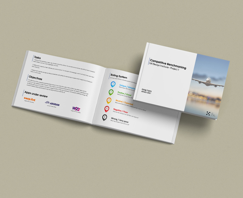
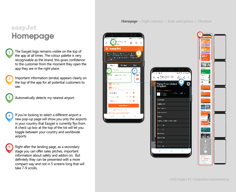
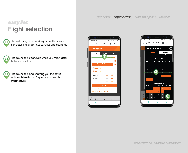
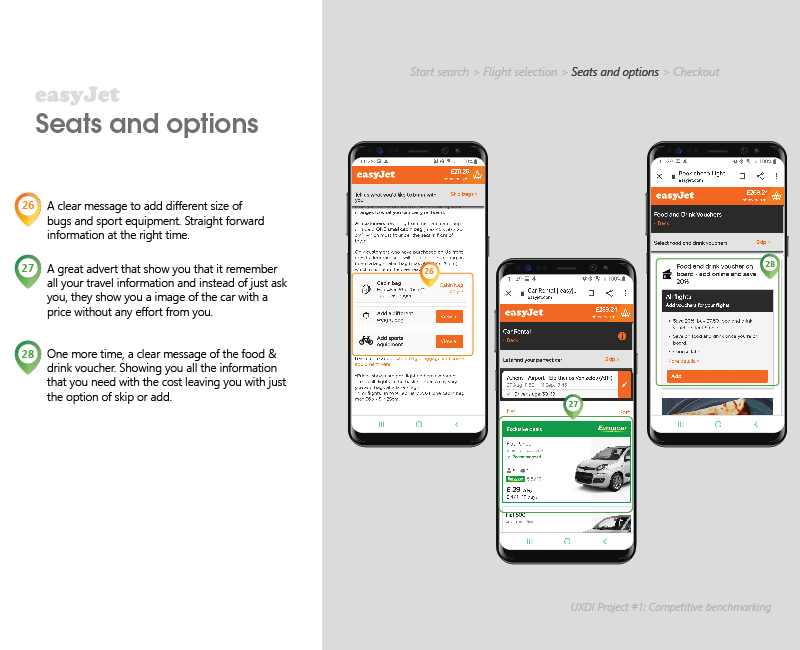
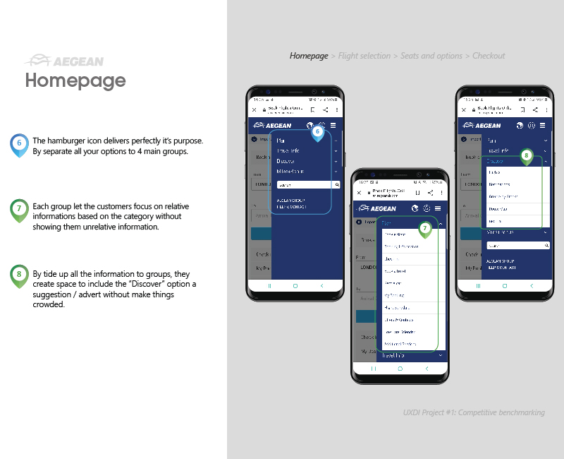
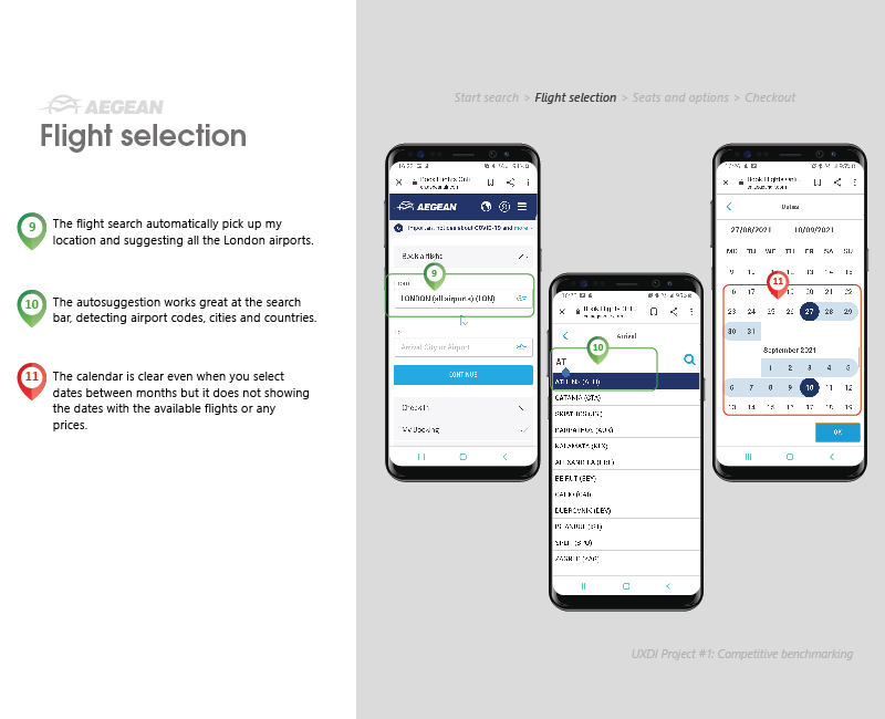
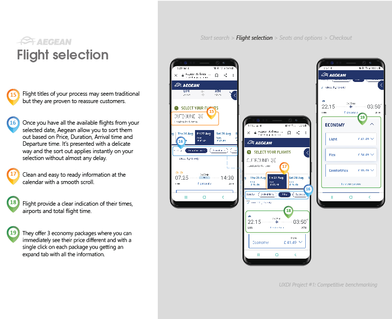
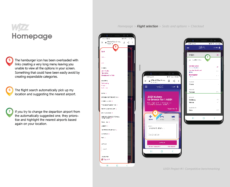
The purpose of carrying out competitive benchmarking is to review other products and determine what features work and what they aren’t doing so well so that your product can be improved. By comparing features of other competitors’ products side by side, it’s easier to spot what is done well and what isn’t.
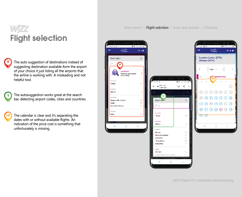
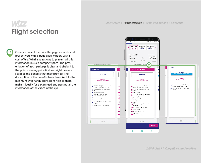
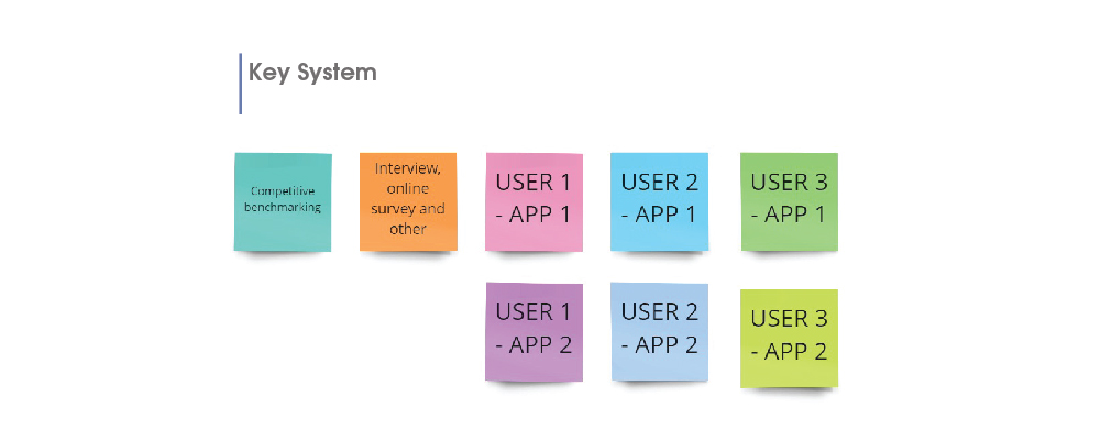
My benchmarking was based on the booking process across three major airline sites
I colour coded my opinions into Green, Amber, and Red alongside with commentary on the pros and cons.
a. Easy Jet
b.Aegean
c.Wizz
You Can View The Whole Competitive Benchmarking In Details From The Link Below
PROVIDING A VALUABLE OVERVIEW THROUGH QUICK FEEDBACK
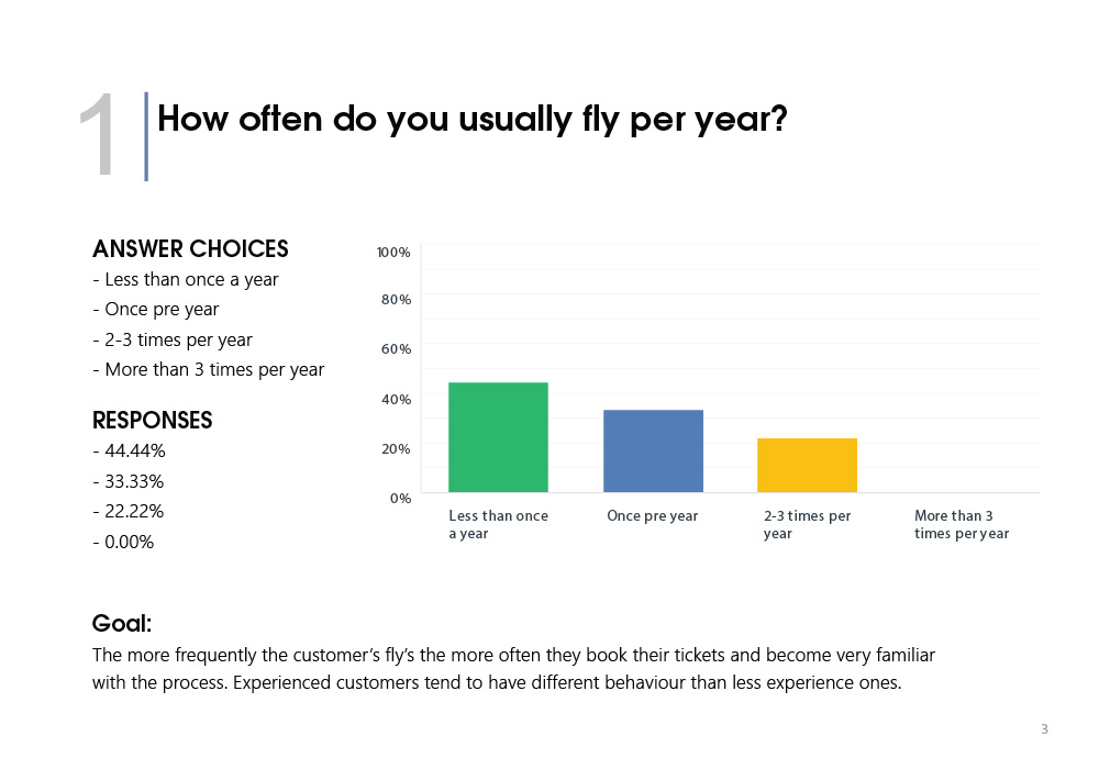
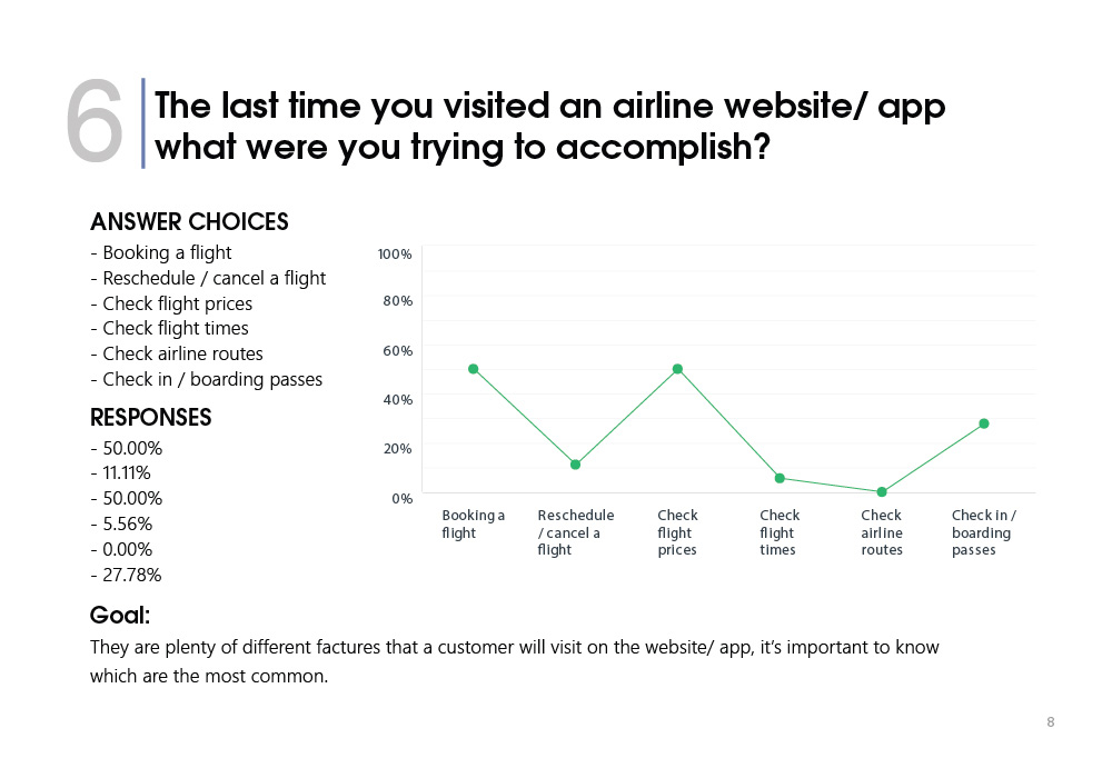
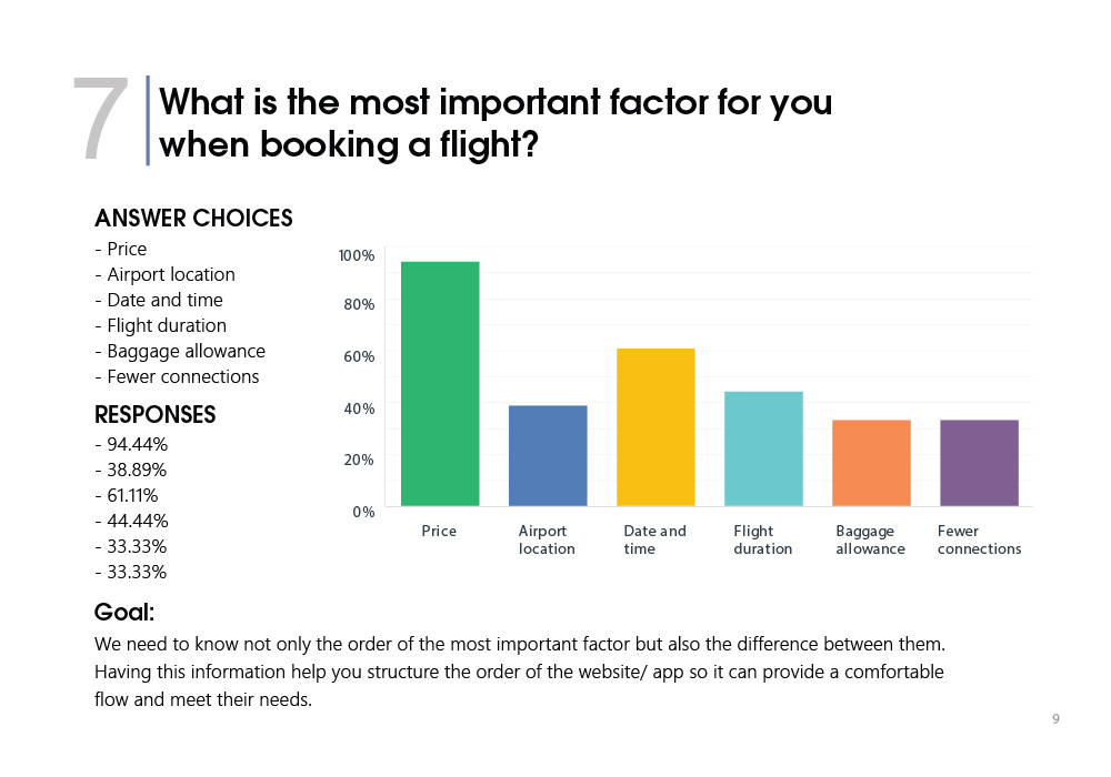
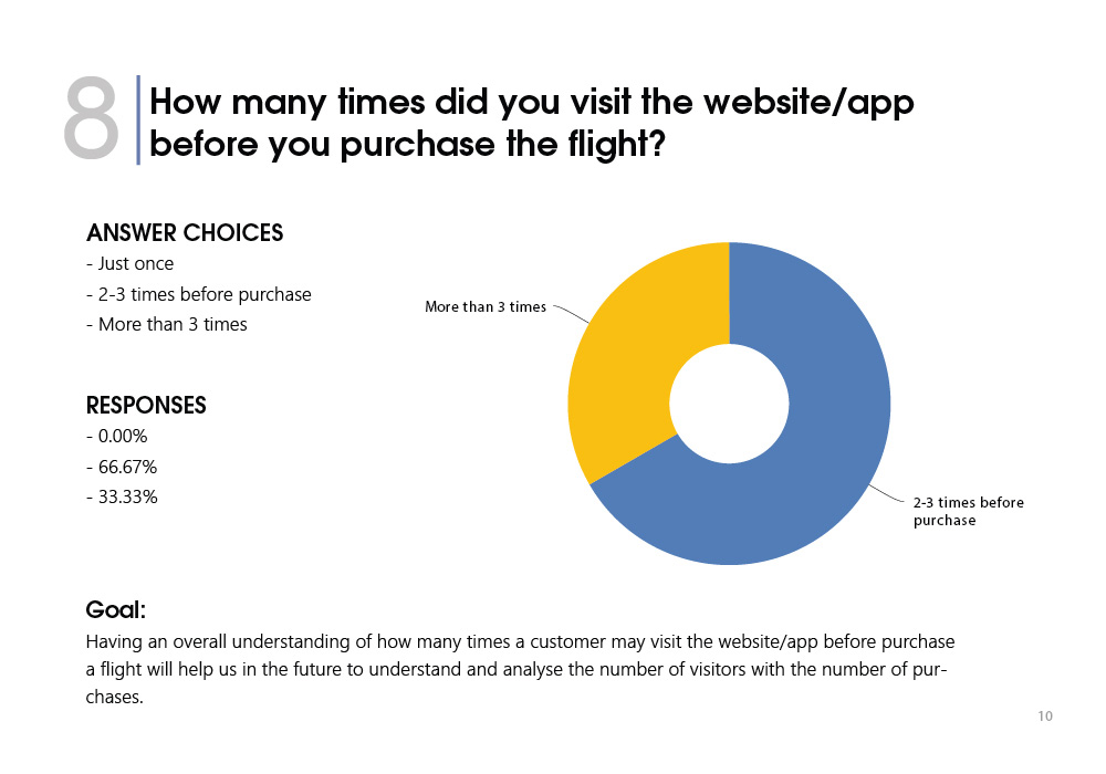
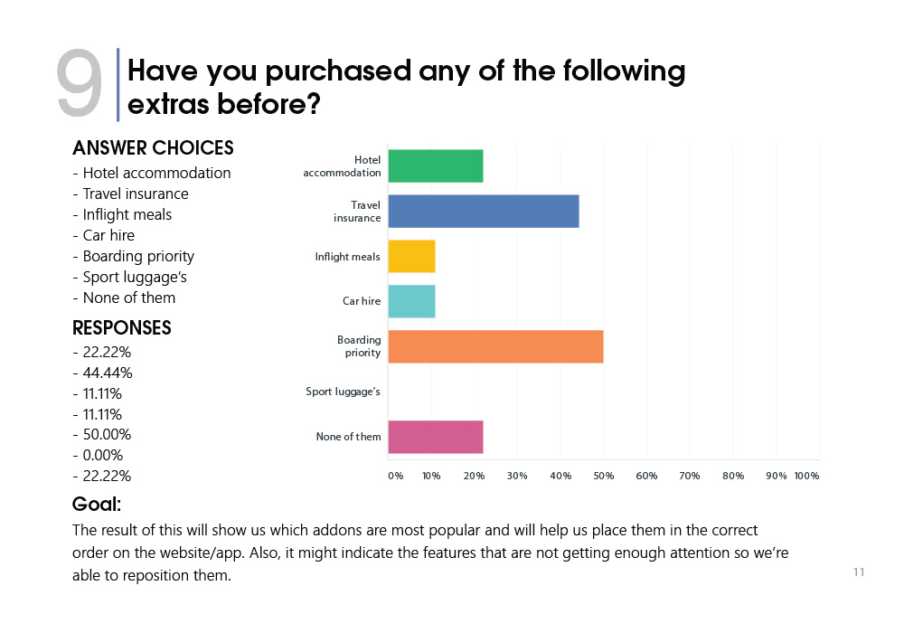
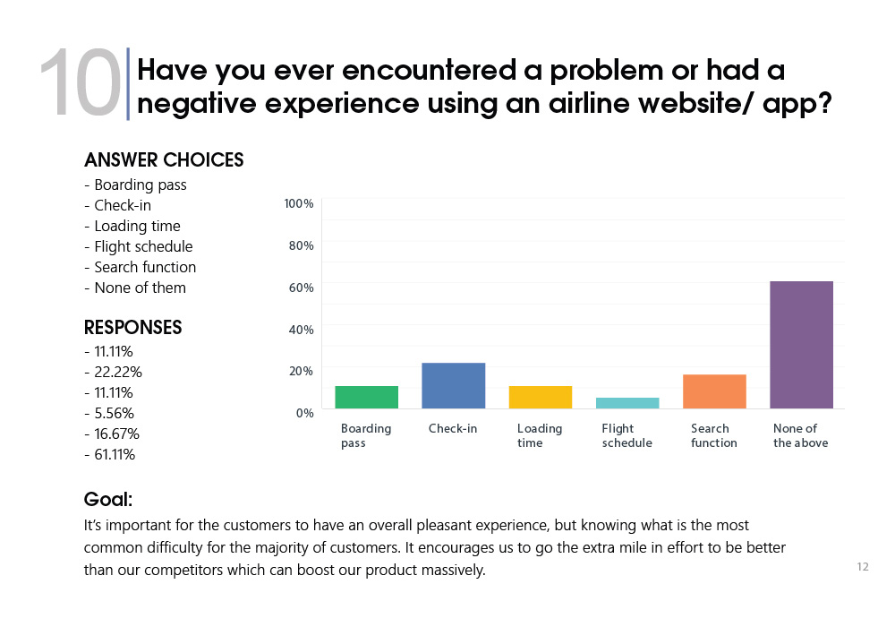
To gather quantitative research and to compliment my usability test and interviews, I created an online survey with nine questions. In all, 42 people responded.
Results:
40% Travel less than one per year.
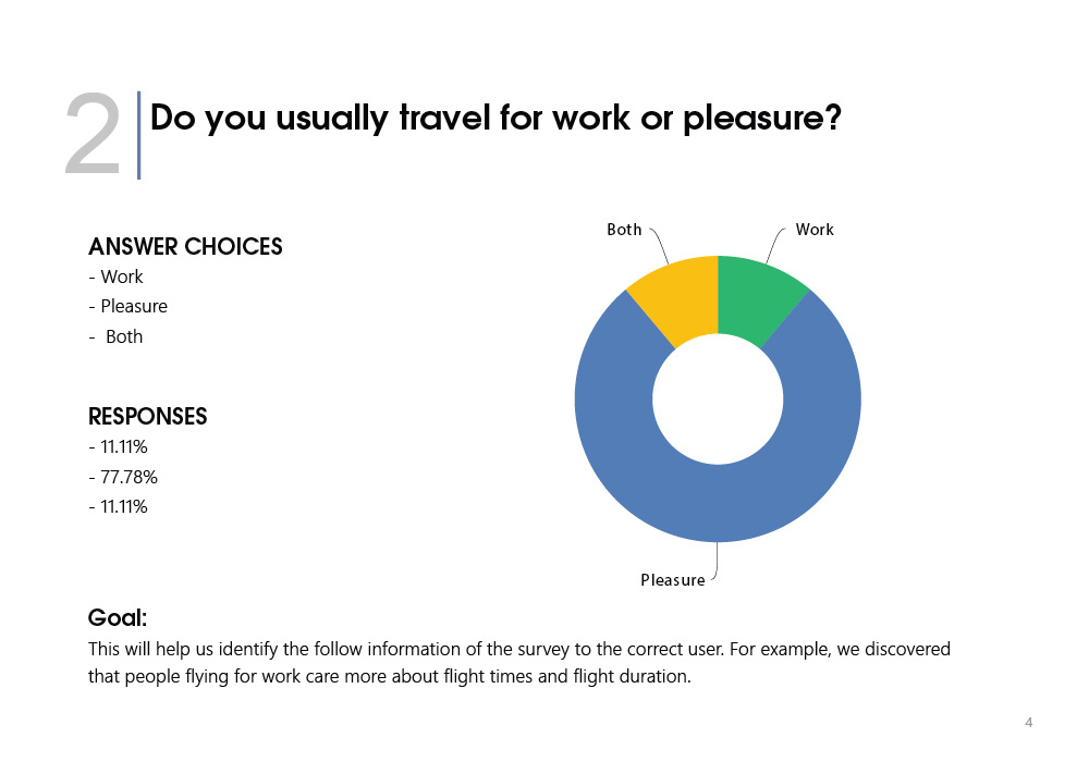
Travel for pleasure is the most popular reason.
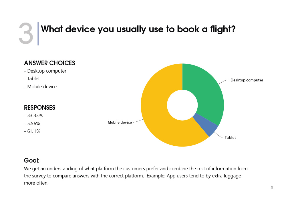
Mobile was the most frequently used device for purchasing tickets.
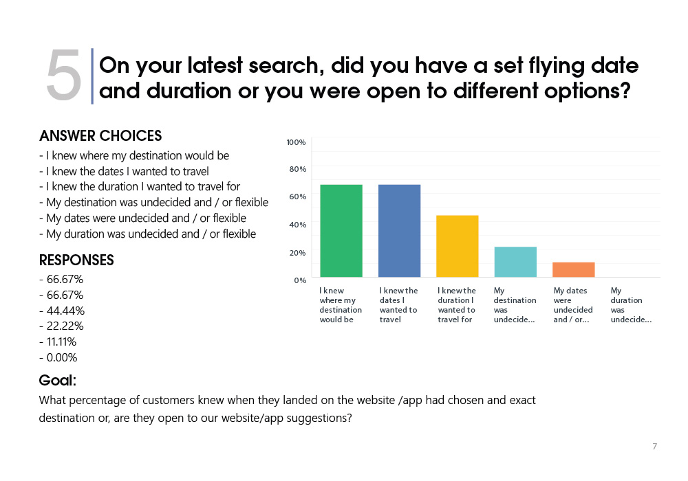
66% of users knew where there want to fly, and the exact dates.
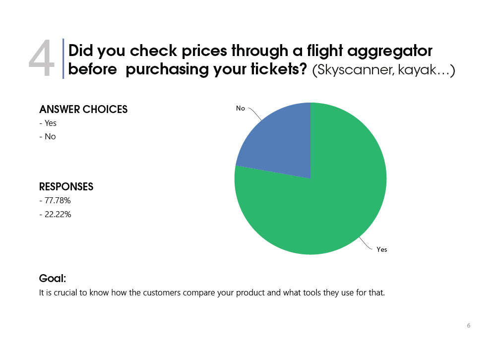
Price is the most affected reason to book a flight, followed by dates and flight duration.
66% of all users did complete their booking on their 2nd or 3rd visit to the app/website.
You Can View The Online Survey In Details From The Link Below
I CONDUCTED USABILITY TESTS WHICH CONSISTED OF AN INTERVIEW AND THE COMPLETION OF TASKS ON 2 AIRLINE APPS
Before Conducting The Usability Tests I Created 4 Documents:
Recruitment screener
Consent form
Test objective list
Test script
These documents would have several key uses.
Firstly the screener would help me understand the type of user I was looking for and the consent form allows me to use their data and meet GDPR guidelines.
Then the objective list and script would help keep a structure to the tests and also define the purpose for testing. For the script to work efficiently, I created two scenarios for the users to follow which I could then compare afterwards.
Results:
Users are focused on a single, primary task.
Females and families are more likely to pre-book seats together with males less likely to do the same.
Seat options are always too confusing, especially when booking a ‘package’.
Frustration causes users to make more mistakes - a vicious circle.
Clear navigation is critical.
Clarity of information is critical for trust.
Clear price comparisons and breakdowns are critical for trust.
Forced login or account sign up is a real turn off.
You Can View The Usability Test From The Link Below
Through the research methods highlighted above, I acquired a large amount of raw data – both quantitative and qualitative. The goal of the research had been to identify the problems that FLY UX should be solving for users.
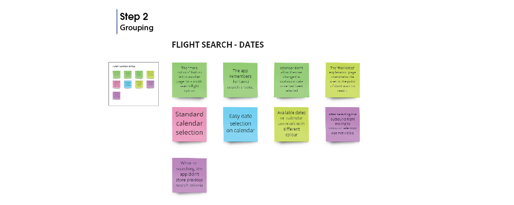
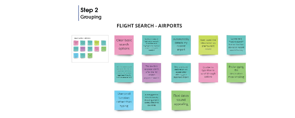
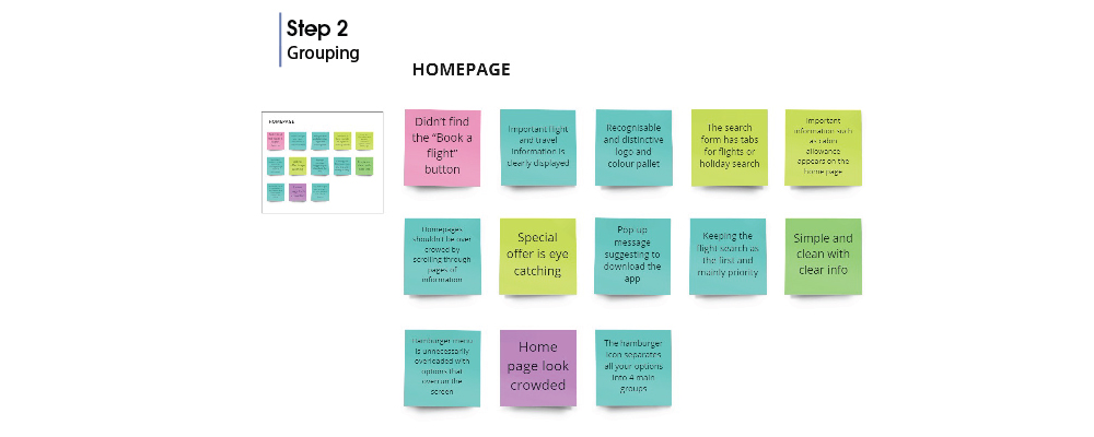
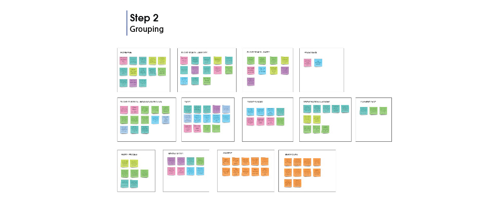
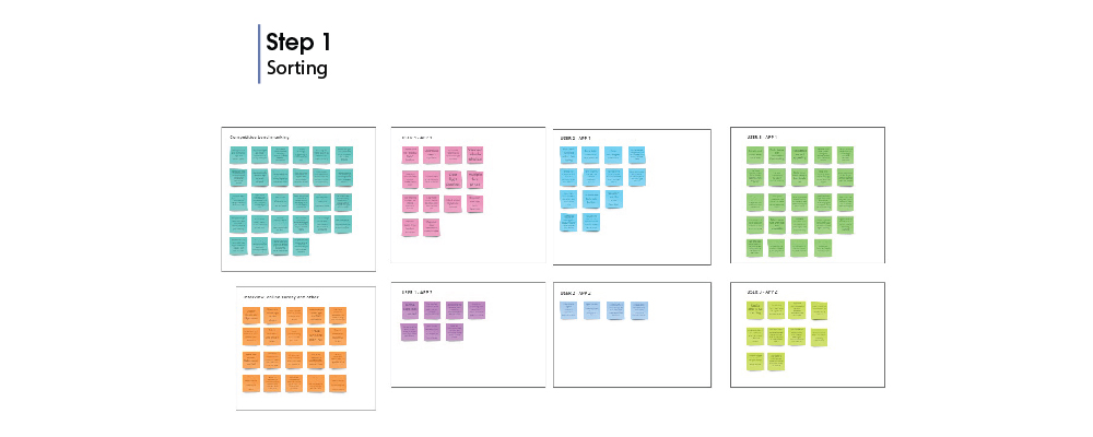
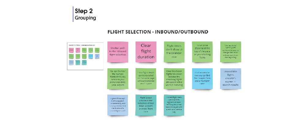
2.1 Affinity Diagram
AFFINITY DIAGRAMS ARE USED TO START ANALYSING DATA TO PULL OUT POINTS THAT COULD BE WORKED ON AND COMPILE THEM IN A STRUCTURED FORMAT. THIS WORKS BEST WITH A GROUP OF PEOPLE BUT DUE TO COVID RESTRICTIONS WAS CONDUCTED WITH THE HELP OF ONE MORE PERSON.
As we went through each document we looked for pain points, mental models, positive features, user primary and secondary goals and context. We wrote a single detailed observation per sticky note that firstly we gather them all together and secondly we separate them into groups.
Homepage
Flight Search
Training
Flight Selection
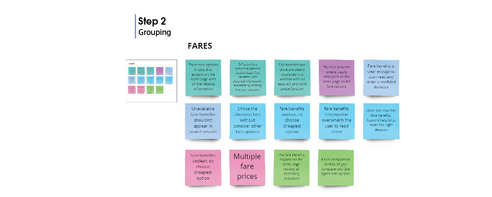
Fares
Flight summary
Addons
Payment
Flow Progress
Mental Model
Context
Behaviours
Thanks to online tools like Miro, it was easy to organise my notes into colour-coded groups:
You Can View The Affinity Diagram From The Link Below
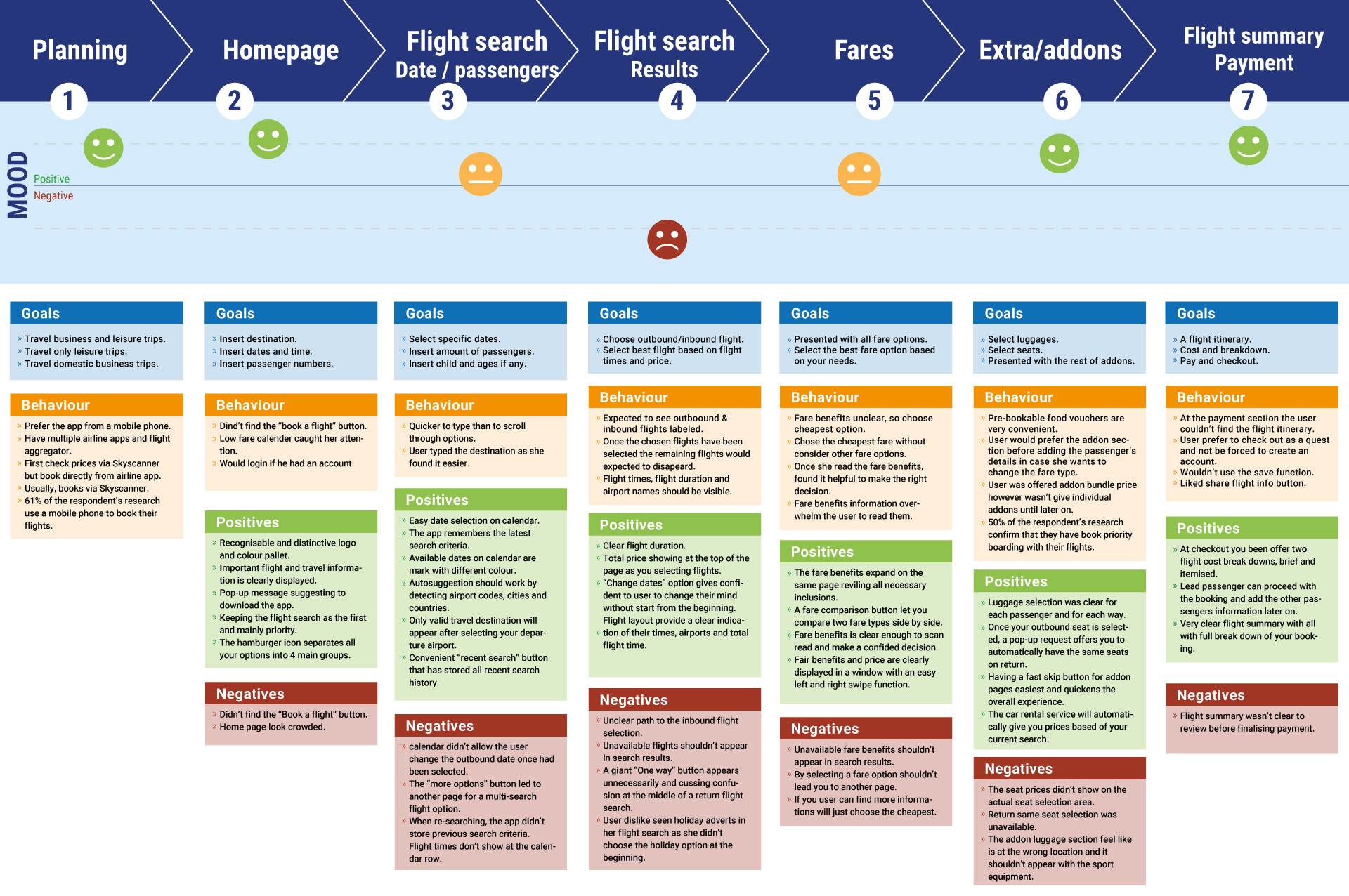
Creating a customer journey map allowed me to put more structure to the analysis of my research data. Corresponding with the groupings from my affinity diagram, I was able to determine context and touchpoints, behaviours and their pain points, and the high-priority steps in the customer’s journey.
You Can View The Customer Journey Map From The Link Below
THE FLOW DIAGRAM IS THE FIRST PHASE OF THE DESIGN.
With all the findings from our research and analysis, we can finally map the road of a high-level flow for a single-use case. From the Home screen to the Payment Confirmation page.
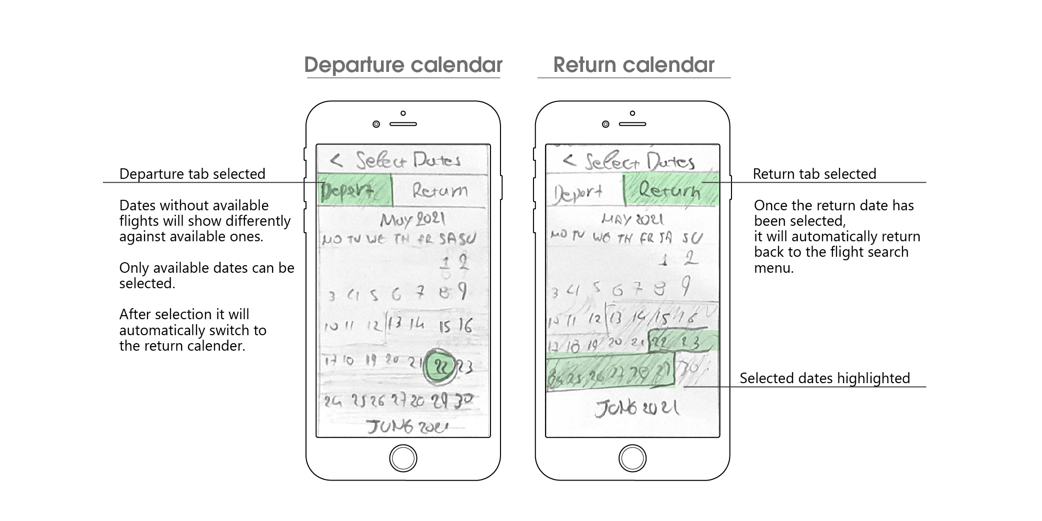
I began the process by making several sketches of the flow which allowed me to quickly translate my ideas and thoughts to paper.
With every sketch, I was able to refine and address the issues that were uncovered in my research. Once I was happy, I recreated the flow digitally, fine-tuning the small details.
Results:
Minimised the number of screens required to complete the task of booking a flight.
Reduced and sectioned the number of add-on's and extras screens so they don't interrupt the flow of the process.
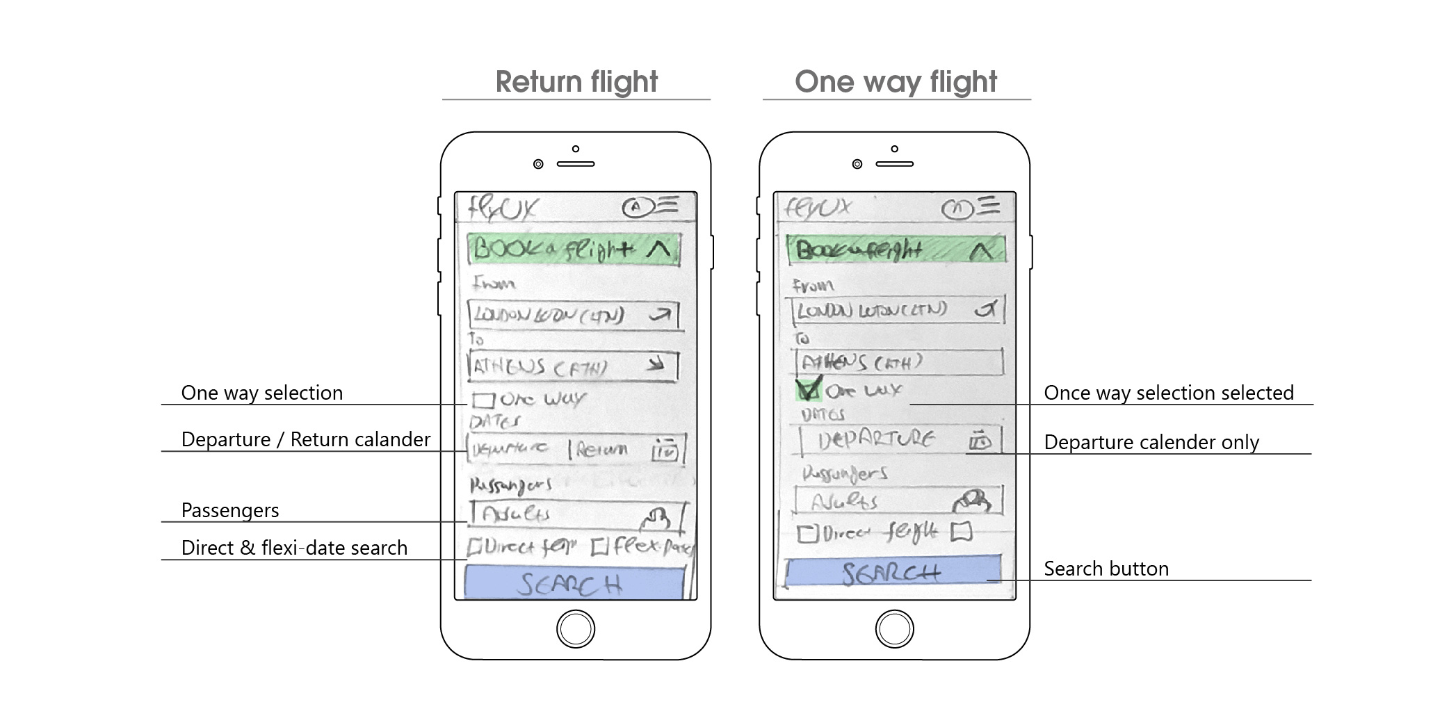
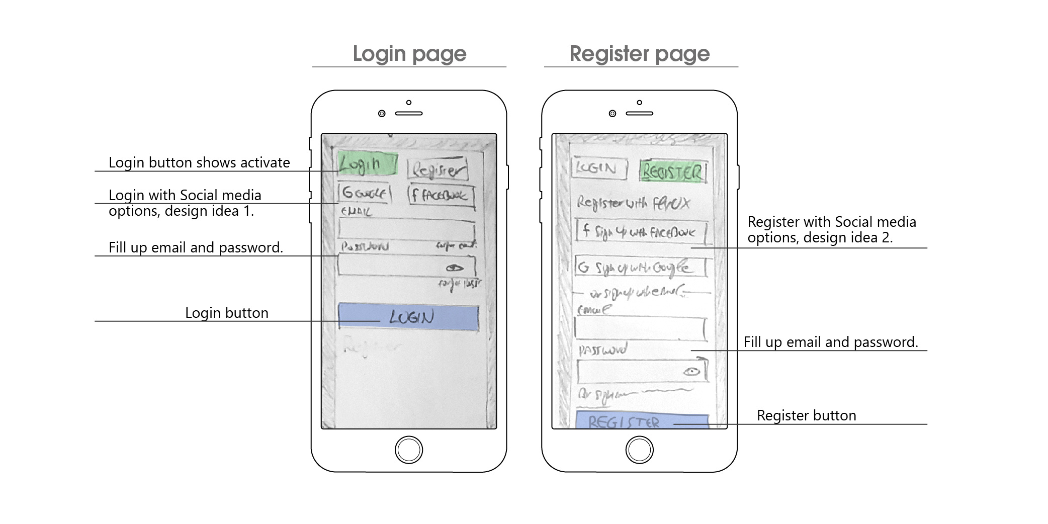
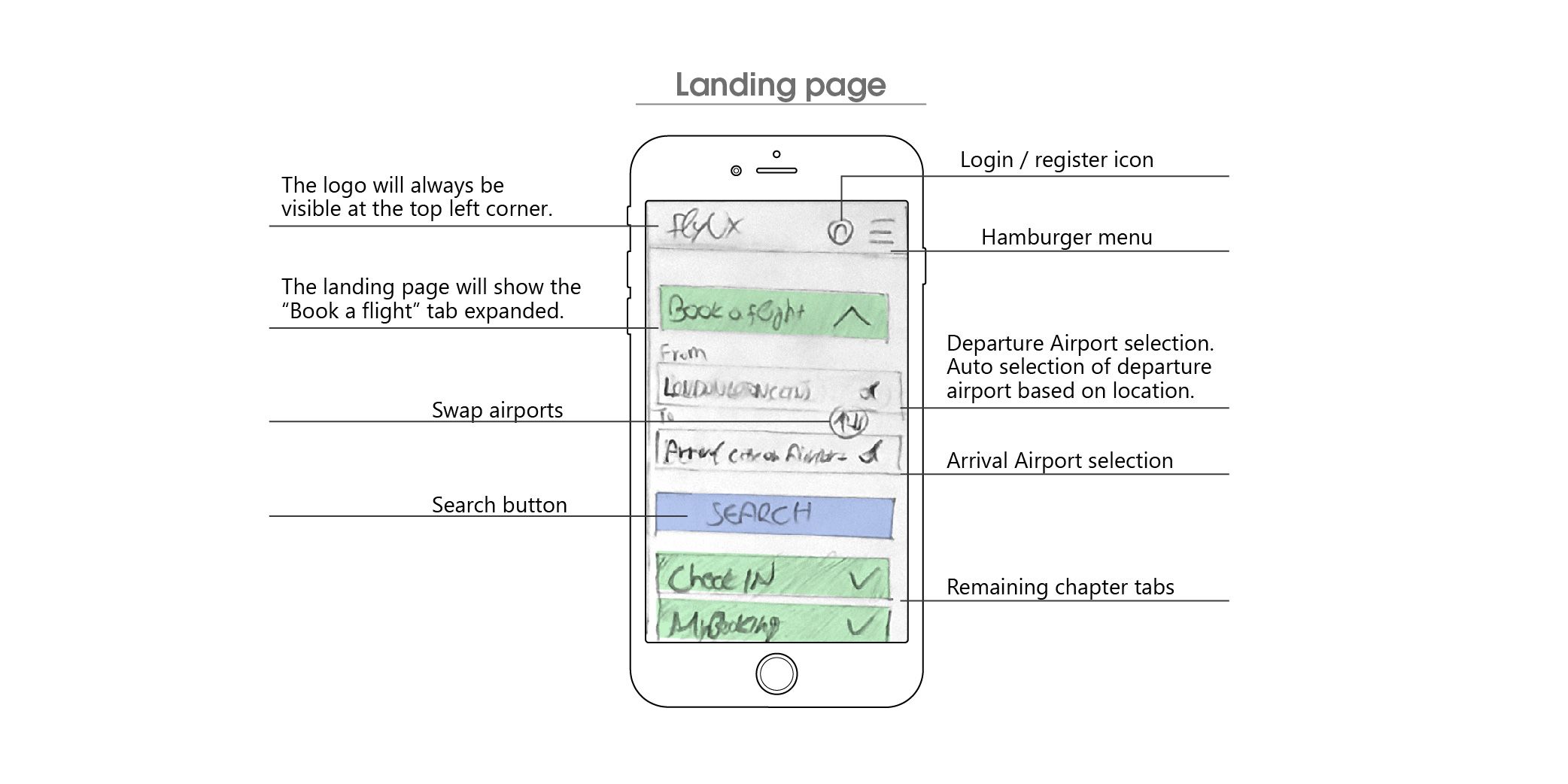
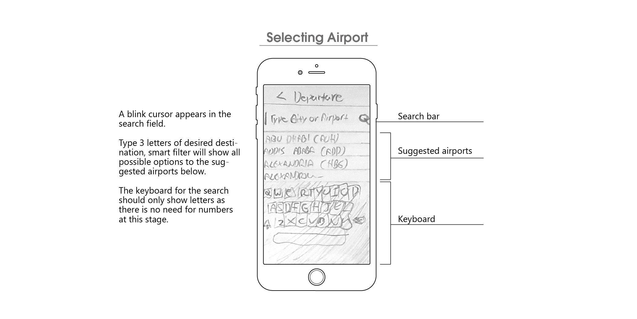
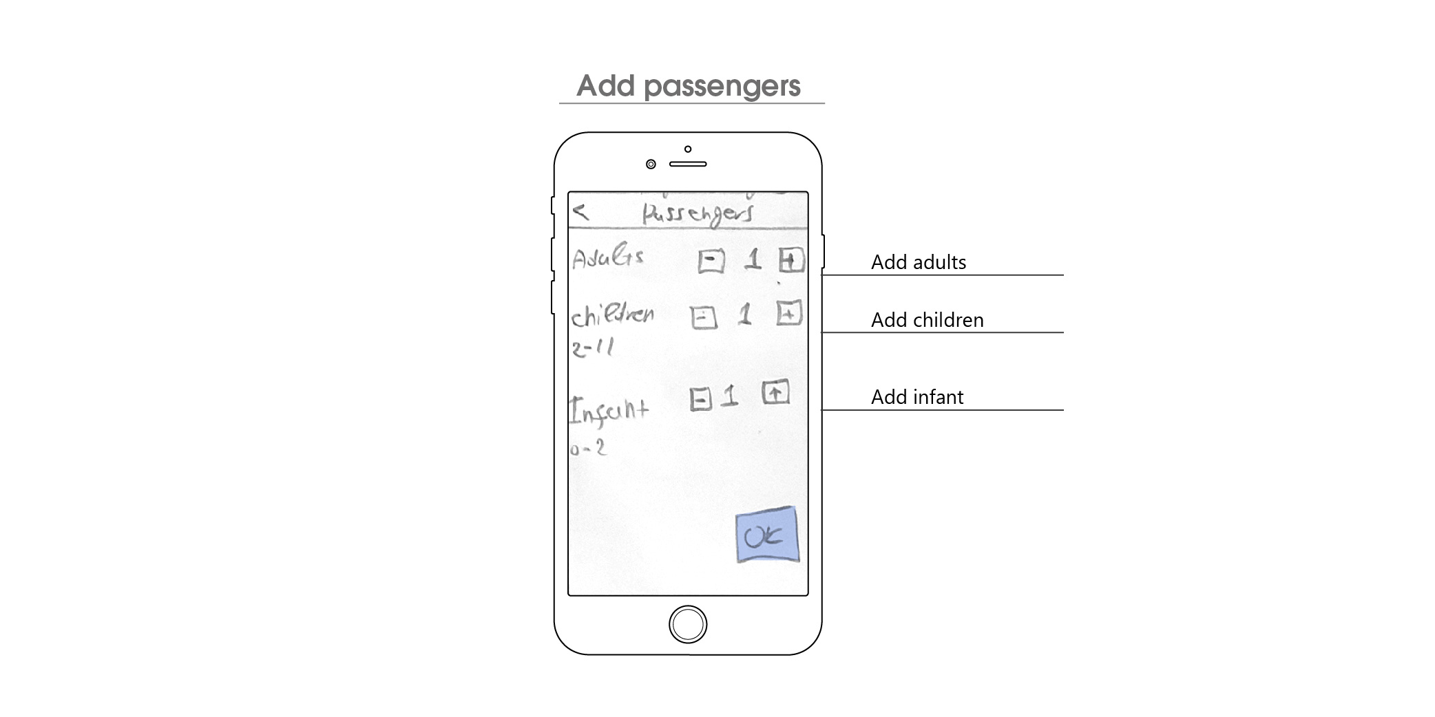
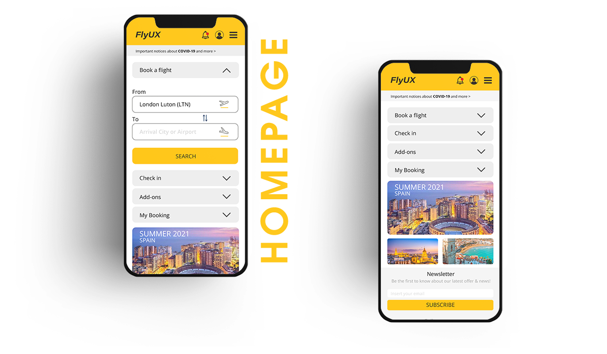
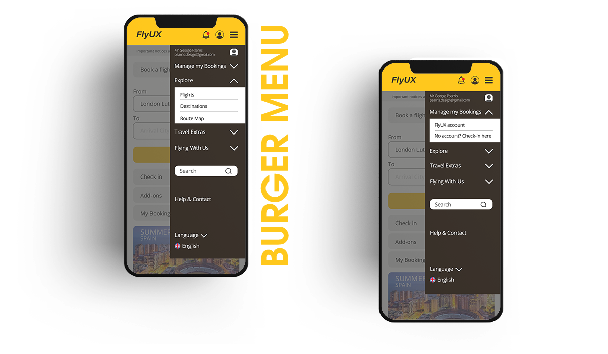
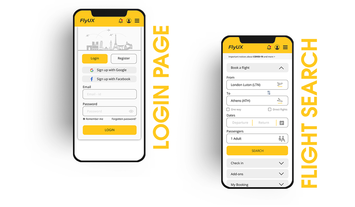
I SKETCHED THE INDIVIDUAL SCREENS FOR THE APPLICATION TO DEFINE HOW EACH ELEMENT WOULD FUNCTION AND HOW THE USER WILL INTERACT WITH THEM. AS WELL AS WHAT INFORMATION THE USER REQUIRES AT EACH STAGE OF THE PROCESS.
These sketches were converted into an interactive prototype and a wireframe document.
Defining a navigation style:
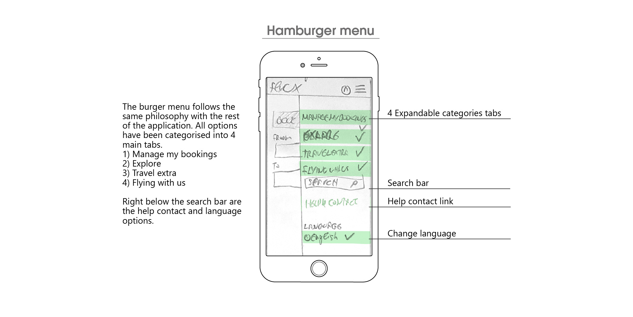
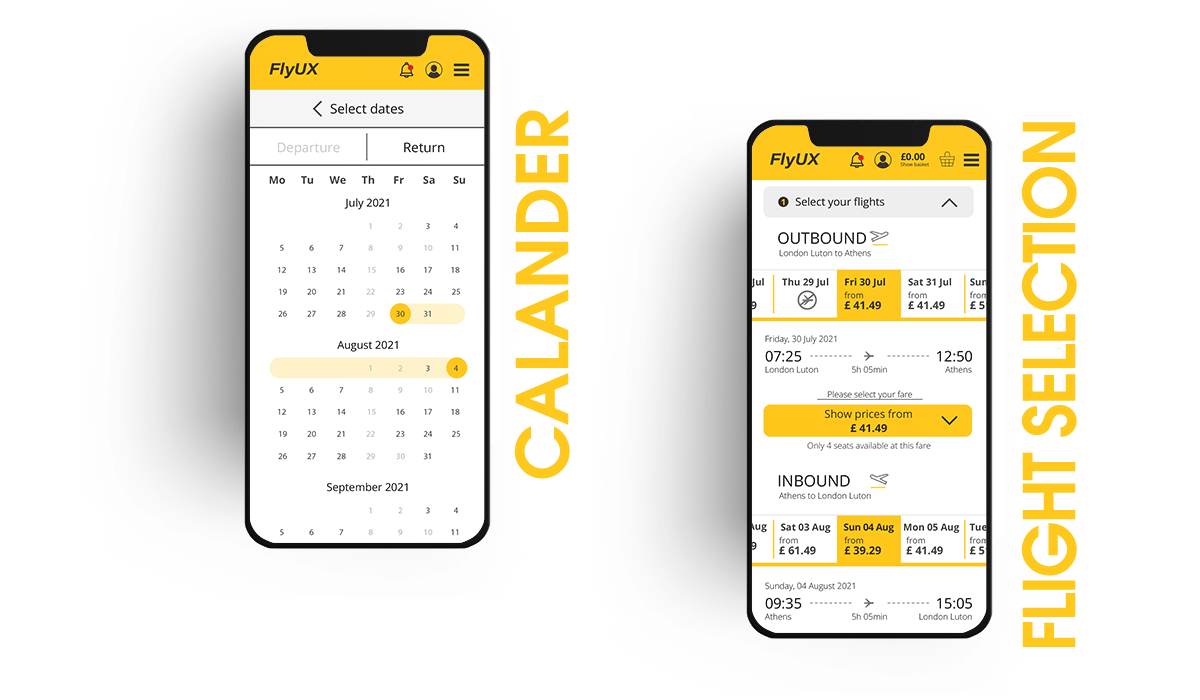
As booking a flight is most commonly a linear process that once you are in that path you can go only forward or backward by losing your pre-made selection I decided to design a vertical tab process where the user has the freedom to move back and forwards without losing his pre-made selection.
At first, I separate the main reasons that a user will visit the app into 4 sections. Booking a flight of course has its own section. Inside the “Booking a flight” I separate all the process steps into 9 chapters.
Results:
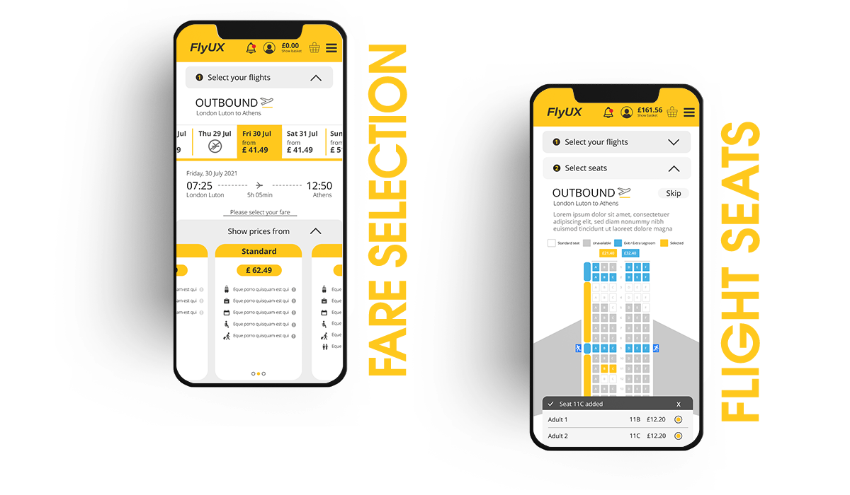
Fare selection: Fares are selected from a collapsible panel when a flight result is tapped. This prevented the need for an additional fares screen. This was a change from my flow diagram and made the overall process move more efficiently.
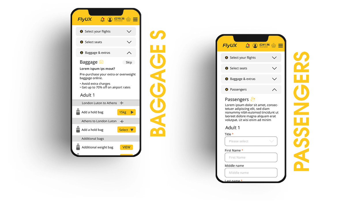
Bag selection: From my research, I found that bag selection was an area of consistent confusion. Design choices made to address this included creating an 'Add Extras' screen. As users understand that they have already picked a bag with their fare selection. A toggle switch allows the user to add an additional bag for one or both flights. As adding and the additional bag was a reoccurring user requirement that presented itself during my research.
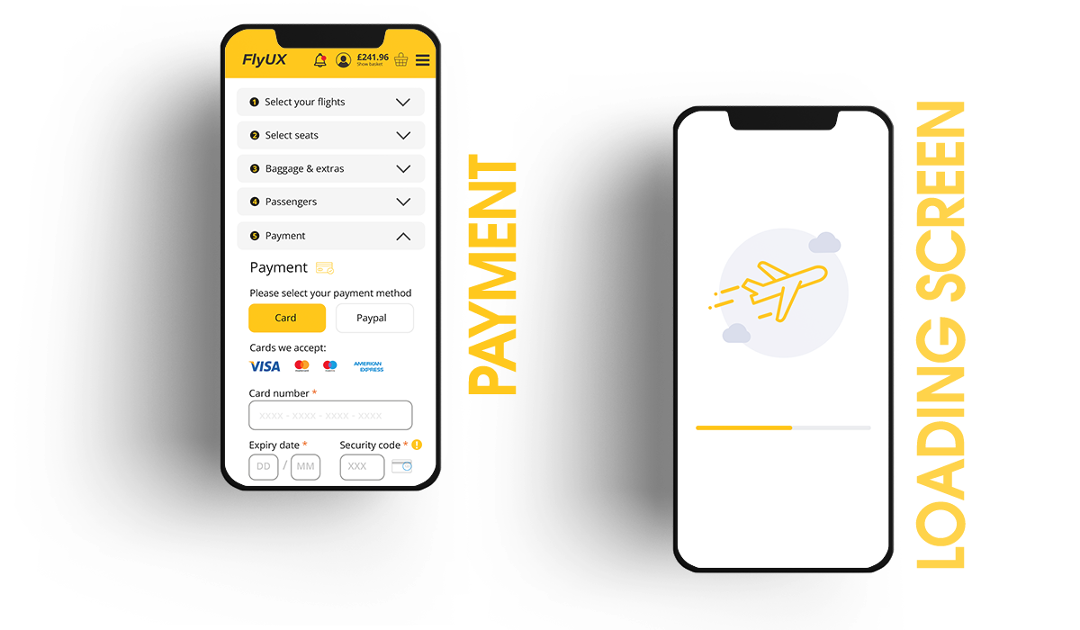
A consistently placed 'Continue' button that becomes visually active once all of the required tasks on-screen are completed.
ONCE ANY POTENTIAL ISSUES WERE IDENTIFIED FROM THE LOW-FIDELITY PROTOTYPE, I DEVELOPED A MORE DETAILED PROTOTYPE USING AXURE RP.
A reduced colour palette allowed me to focus even more on the structure and architecture of the screens. Having a decent amount of details meant that during the testing phase users were able to navigate through the flow as they would on a live App.
Try The Interactive Prototype That I Build With Azure RP!
Please use the following criteria for your search: London Luton to Athens | 12/07/2022 – 18/07 /2022 | 2 Adults | Basic Fare for both flights 11B-C seats | 15kg baggage for each passenger.
FOR THE FINAL STEP IN THE UX PROCESS, I DESCRIBED ALL THE ACTIONS AND RULES THAT DEFINE THE INTERACTIONS INTO WIREFRAMES. THIS IS ESSENTIAL TO AVOID ANY MISUNDERSTANDING AND TO SHARE ALL THE NECESSARY INFORMATION WITH THE DEVELOPERS.